Hiding messages in colour-indexed images

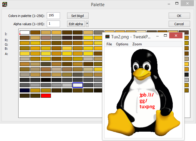
Check out this picture of Tux, the Linux mascot, in PNG format. What if I told you that I’ve hidden a message on the penguin’s belly. Can you see it? Short answer: no, you can’t, but it is there.
A common trick is to write a message in a colour very similar to the background. The human eye can’t tell the difference because the colours are so similar, but a computer obviously can. But whip the above image into Paint and try filling the belly – you’ll see there’s no different colours there. This trick is a bit more subtle than that and it uses the way that colour information is stored in a PNG image.
In a regular bitmap image, the colour of each pixel is stored in-place. In a colour-indexed or paletted image, colour information is stored in a palette of colours (normally up to 256) with each colour referenced by a number. Each pixel is just represented by a single byte which stores the number of the colour that pixel should be. Lots of space is saved because you’re only storing the 24-bit colour definition once and referring to it multiple times with just 8 bits. This works well for digital artwork and web assets that only use a limited number of colours. 256 might sound quite low, but Tux up there is only composed of 194 different colours so even with the shadows and highlights there’s still a bit of room to manoeuvre. For comparison, the color-indexed PNG version of Tux is 12KB whereas the bitmap version is 256KB – almost twenty times larger.
In a normal image, you expect to see a palette of unique colours whether it’s full or not – there’s no point in storing the same colour twice. It’s either wasting space or taking up a slot that a different colour could use. If you take a look at the palette below, you’ll notice redundant information: the colour white appears twice in the palette, once at the beginning and once at the end.
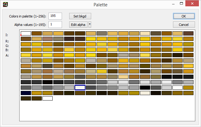
This is the essence of the trick. All of the pixels on the stomach are white, but some of them are referencing the first colour cell whereas the others are referencing the last colour cell. So how does this store a message? Well, I can write some text (or draw a shape or whatever) onto the image in one distinct colour and that colour will get saved into the palette like normal. Then, I can manually change that colour to match the background colour using a tool like TweakPNG. It’s then invisible to the naked eye and also to an image editor, unless you look at the palette directly like this.
That’s exactly what I did to the picture above. If I change the last colour cell to a different bright colour, the message is revealed.