Weeknotes S2E1: Data's gonna date
I’ve had some interesting conversations this week, and felt motivated this weekend to actually write some weeknotes. Of course, the weekend came and went (blurryily due to the Great British Beer Festival) but my motivation has not abated. So here we go — season 2 of weeknotes.
Keeping data fresh

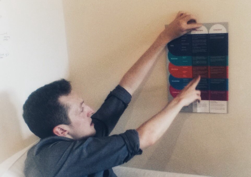
In a conversation with Tom G of Nadata, we ended up talking about scaling and how it applies to data and I got the opportunity to collect and critically assess my thoughts. I also received a copy of the Open Data Institute’s Design for Scaling canvas from the lovely members team and I recognised a few of my thoughts on there. It’s a pleasant feeling when what was a bag of random ideas actually click into place and form a coherent opinion!
In my last role I was lucky enough to meet a whole host of people and learn about the difficult job of getting the right data in the right place at the right time. What struck me was how difficult the job of providing live data to people is, and how even a team of excellent people who really know what they’re doing are fighting an uphill battle.
The team had to coordinate an update schedule with a bunch of other independent teams and make sure that everyone was ready to accept a new version of the data when it went live. The schedule was set weeks in advance and often when their source data wasn’t even ready yet, so if something went awry at the last minute people somehow has to just do it faster and meet the deadline. The pressure, understandably, was unpleasant. If the best are having to work this hard, the rest of us really have little chance.
Since then, I’ve seen people building new systems that will cause this exact problem again. One version of the data loaded, one version of the data served, a song and dance in human land to make sure that it works. But software people had this problem for years (with source control systems) and solved it, and it’s high time the data people got hold of the answer too.
And so I sat down and wrote a post. As ever, kudos to Andy Bennett for sharing his ideas.
If you’ve read the post, you might be thinking that the answer sounds unacceptable — that your organisation must always have a single view of the truth. How else could two systems communicate with each other, if they don’t share a common view? The solution to this is pretty simple but too big for this margin, but it involves systems remembering a history of the data and dynamically selecting which to use when talking to each other. I’ll get to it in another post sometime.
Layers of data and the MVP enemy

Another topic of conversation that keeps cropping up is the constant tension between getting value for money by building a thin MVP and designing for change by implementing a wider architecture.
Agile thinking and The Lean Startup all advocate for building using an iterative approach, delivering value early, testing regularly, and failing fast when ideas don’t have positive test results. In general this is a good thing, and was especially good for Government where the status quo was spend millions of pounds on a massive system and maybe (rarely?) get something good at the end.
The problem with the way in which this approach is often implemented is that it discourages any kind of architectural thinking or forethought. People don’t see the value of an architecture for just an MVP, and so build some long, thin spike of bespoke functionality that meets their user needs and nothing else.
It means when a user comes along with a different need, you can’t service their needs and they can’t even peel away the top layer of your architecture to service their own needs — they’re just starting from scratch. There was no architecture that meant anything was designed correctly for re-use. Given how many tech leaders chirp about “re-use”, it’s suprising how few of them are willing to actually invest in it.
The same problem exists in data. Publishers frequently focus on a specific user need for their data, and make sure that need is met. Rarely do they design so that even if the end result of their data analysis isn’t what a user wants, the user can drop down to a more raw version of the data to do their own analysis. Sometimes it happens, but normally it’s just “raw data” or “end result” with no intermediate (and helpful) layers.
A good example of this is data visualisations, where the end result and maybe the raw data is published, but not the intermediate steps. If users want a slightly different visualisation, they’re starting again from raw.
I think part of the reason no-one does this is because publishing is an effort, and the result of transforming data is often not something that can be published without more work. So I’d like to write a post about that, but maybe my thoughts haven’t fully formed yet — I’d appreciate anyone’s insight on it.
Using data in the humanitarian sector
I’ve been reading lots of stuff this week about how the humanitarian sector collects and processes data, normally very personal data such as biometrics. I think this is a truly difficult sector to be thinking abut data in because the people involved are so vulnerable that a small amount of data is open to severe misuse.
Everyone seems keen to throw technology at the problem, whereas my overriding thought is that there are no quick fixes — this is going to be hard to get right. Not least because the issues really stretch our ethical intuition to it’s limit.
I’m only really just starting to read about this area so any good links would be appreciated. Here’s what I’ve been reading:
- Betting on biometrics to boost child vaccination rates — The New Humanitarian
- Biometric Recognition of Children: Challenges and Opportunities — Michigan State University
- Stop Surveillance Humanitarianism — The New York Times
- Statistical Disclosure Control — The Centre for Humanitarian Data
I’m always bad at conclusions, so I’ll just say thaaaaaanks for reading my weeknotes, folks. Laters.